This website uses cookies so that we can provide you with the best user experience possible. Cookie information is stored in your browser and performs functions such as recognising you when you return to our website and helping our team to understand which sections of the website you find most interesting and useful.

Yellow there! I have been given the green light to produce an insights piece about colour theory.
Colour is the entity that gives our world so much beauty and character just by existing. Once you have red through this piece, you’ll see your surroundings in a whole new light.
That’s enough of the terrible puns. Colour truly is a magical thing! Imagine a beautiful sunset in grey or wrapping the lengths of twinkling grey lights around your magnificent grey Christmas tree? It just wouldn’t be the same.
We rarely question the ‘why’s of mother nature, just accepting that the world is what the world is, and who are we to doubt it? But if we do decide to dig a little deeper into colour theory, what we uncover is fascinating.
What is colour and why does it exist?
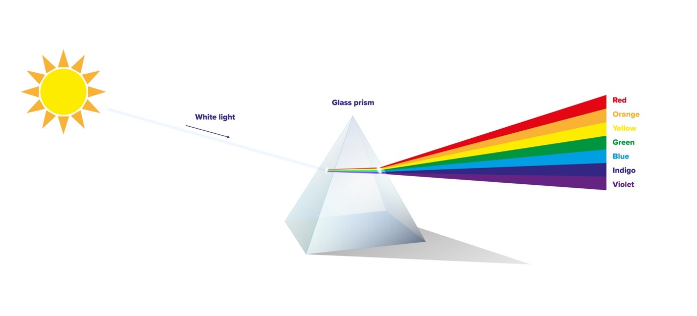
It’s easiest to understand colour if you stop thinking of it as a property that belongs to an object, and more a property that is given to an object through light. Light as a substance is made up of a series of light waves, each containing every colour that our eyes can possibly recognise.
Put simply, each individual wave of light is a tiny invisible rainbow. When all the colours of the rainbow are present, they accumulate to white. When none of these colours are present, we see black. All the other colours fall between these two outputs, and the colour we see is determined by how many colours are absorbed by an object, and which colours are reflected into your eyes.
If you imagine a little wave of light soaring through space and time to eventually spiral down and hit Santa Claus on the hat, what we are seeing are those invisible rainbows getting dismantled and leaving only the colour red to reflect back – the other colours have all been absorbed by that hat.
Pretty fascinating, right?
Light is also a key source of heat. When you wear dark clothes in the sun, the dark material is absorbing all the light energy that hits it, converting light to heat energy and reflecting very little to no light/heat. This is why we often overheat if not wearing lighter colours on a sunny day, which would counteractively reflect that heat away from your body.
How have we harnessed the power of colour?
There are ultimately two different methods that we as humans have created in order to recreate colours at will. One way is to replicate what natural objects do to obtain their colour – we use a substance that absorbs the colours we don’t want and reflect the colours we do. The most common example of this is paint.
Colour in printing
You may have heard the phrase ‘CMYK’ in reference to paint and printing, standing for Cyan, Magenta, Yellow, Key (Key is almost always Black). This is when a printer combines these four colours to create one specific colour. CMYK is a subtractive colour model, named so because we take a fully formed light wave (which is white) and subtract (or absorb) colours from the wave to leave the desired colours to be reflected.
Colour on screens
The second way is to create our own light waves and combine them to emit a desired colour. This is commonly known as an ‘RGB’ colour model (standing for Red, Green and Blue). RGB is an additive colour model, meaning that we start from darkness and add light to create colour – if we projected red, green and blue together, we would get white.
The RGB system is used in most screens, projectors and electronic devices. The system has become very popular in the 21st Century due to the amount of screens we have in our everyday lives. In fact, many popular companies have been rebranding and adapting their logos in recent years to include brighter, more vibrant colours within their palette to cater for the way the majority of people see their brand – through RGB screens.

You might be wondering why we don’t just use RGB when using paint as well. The reason that we start with Cyan, Magenta and Yellow for the subtractive colour model is that those colours are primarily lighter than their Red, Green and Blue counterparts, and once you start subtracting light the colours are bound to get darker and darker – as is the nature of the colour model. Starting with a lighter palette helps to achieve some of those more vibrant colours without the addition of extra light.
Pantones – the colour identifying tool
When it comes to identifying colours there is the popular colour-matching system known as Pantone. You know all those little cards you get in B&Q with different colours and shades of paint on? They’re Pantones – a library of predetermined colours that are each given a unique code or name, offering a way of universally ensuring that a specific colour can be chosen that can’t be altered by exterior conditions, such as different hues or values of a colour being used when mixed.
Why do we choose the colours that we do?
Have you ever looked at a radiant yellow daffodil on a crisp spring morning and thought ‘Isn’t this lovely, it makes me feel all warm inside’? Well maybe not in that exact phrase, but that feeling you get IS yellow.
Colours evoke certain emotions in humans that come from memories, past experiences, and subconscious impressions. For example, whether you’re aware of it or not, the colour blue generally transmits feelings of comfort, trust, and reliability. These emotions come from the way we associate blue with the sky, or water – things that are consistent, predictable, and safe. Another example would be green – associated with fresh air, nature, and outdoor activities.
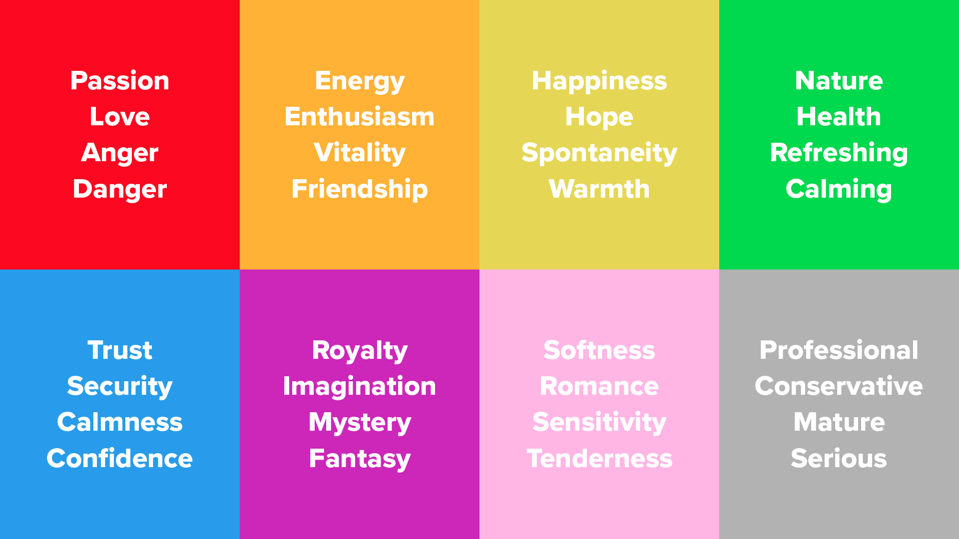
Whilst these impressions are true for most Western cultures, it’s worth noting that they are not universally true. For example, in most Western countries red represents passion and danger, whilst in India red represents purity (which is why in India brides often wear red wedding dresses), and in China red symbolises luck and happiness.
Why Does Colour Play a Big Part in TMC’s Brand Identity?
Brand identity is the personality of your business. It dictates how you communicate your values and product or services, how you interact with customers and most importantly, how customers feel when they engage with your company.
At TMC, we wanted to be seen as vibrant, positive, and brave.
Managing Director, Tim McCloud, shared “When we initially developed our colour palette, a more conservative cyan based blue was used to reflect the summer sky but it always felt very safe. Our clients expect us to be bold and our job is to assist them in achieving greater levels of visibility. The colour pink does just that. If we were not prepared to walk the walk with our own brand, why should our clients trust us with theirs?”
But how has this early branding decision led to TMC standing out within the industry? At the time we established our brand and became ‘pink’ there were very few organisations that used this colour. We immediately stood out. Vibrant colours have since become more popular, but we have shown consistency with our brand colours which have helped us to remain bright, positive, and bold. We are proud to be pink!
Colour me informed
This has been a very brief but hopefully informative overview of colour theory, including how colours are created, how they are seen and the impact they have on our daily lives.
Next time you go for a leisurely lunch-time stroll in the park you might just remember this article and think to yourself ‘All these trees and plants are actually grey, it’s just waves of light being reflected into my eyes that I can see’.
What a wonderful world!
Share this
Because you viewed this insight piece,
you may wish to navigate to the following…